Visually filtering - drag-select and pie/donut
You can visually filter data in most reports by dragging a capture rectangle around the attribute values in a chart or table to select only those values. Some reports, such as pie and donut charts, use keyboard commands to filter.
Funnel and pyramid charts do not support visual filtering.
Alternatively, you can filter the data by dragging an attribute or measure to the Filters bucket in Chart Builder (see Filtering data in Visualizer).
Drag-select the data to filter
Drag-select works both while editing in Visualizer and when browsing in Insights.
Click and drag across to the desired region.
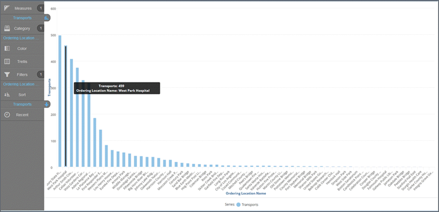
Release the mouse. The chart updates based on your selection. The name of the filtered column displays in the Filters bucket.
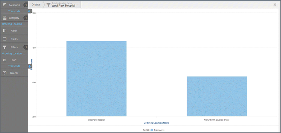
Click 'Original' to remove the filter.
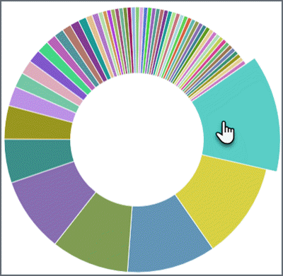
Pie and donut charts - use keyboard commands
Pie, donut, and semi-donut charts use keyboard commands instead of drag-select.
- Press a command
key:
- PC - press Cntrl
- Mac - press shift
- Click a segment on the chart. The segment
enlarges.
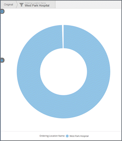
- Release the
keyboard. The chart and dashboard updates to use the selected filter.
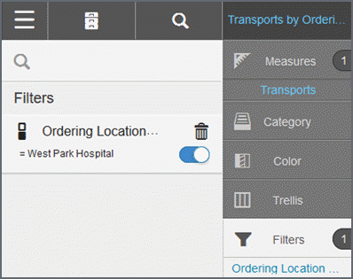
The name of the filtered column displays in the Filters bucket.
- Look
at the Chart Builder column. You will now see that there is one filter
applied to this report. Click the filter button to delete
the filter or turn it on/off.
Notes:
- A visualization can have multiple filters.
- You can use a Visualizer report expression as a filter by dragging and dropping it to the Filters bucket.